How to adapt landing pages for iPhone Duo and Galaxy Z Fold
Foldable phones are not a separate traffic source. They are a different context for the same person. A visitor can arrive on a narrow outer screen, unfold into a near-tablet canvas, put the browser next to a messenger, or turn the device sideways halfway through a form.
That means a landing page needs to adapt to available space instead of assuming one fixed mobile width. The goal is not a special "foldable version" of every page. The goal is a stable path to the next action in every layout.
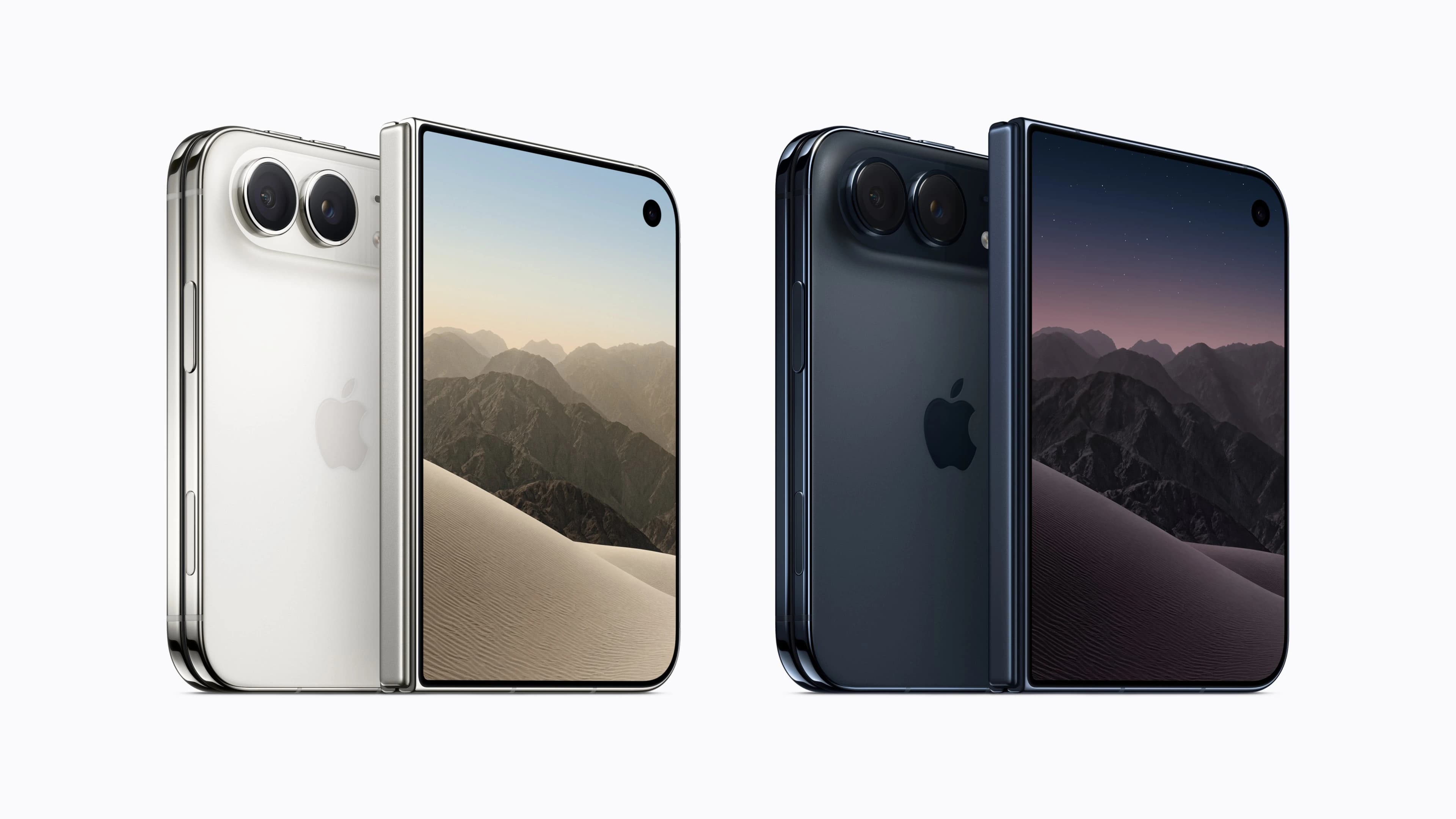
Apple's first foldable, iPhone Duo, has a 5.4-inch outer display and a 7.6-inch inner display; Apple says both use the same aspect ratio so content scales proportionally. (Apple Newsroom) Galaxy Z Fold devices likewise move between a cover display and a larger internal display. (Samsung foldable guidance)
The foldable landing-page rule
Design for the window, not for a device name.
An open foldable can be large, but it can also be split in half with another app. Android's guidance is explicit: available window size changes as a user folds, unfolds, rotates or enters multi-window mode. Fixed device categories are not enough. (Android window size classes)
For a web landing page, this translates into three layout states:
| State | What the visitor sees | Landing-page response |
|---|---|---|
| Compact | Outer display or split-screen browser | Single column, one clear CTA, no side-by-side form fields |
| Medium | Wide phone or half-open browser | Wider content, but keep the primary action in the same reading flow |
| Expanded | Unfolded internal display | Use space for proof, comparison or supporting content, not for a stretched mobile page |
What breaks first on a foldable
1. A CTA placed on the hinge
On book-style hardware, the physical fold can run through the middle of the unfolded screen. Do not place a critical button, input, price or legal checkbox in the center zone. A user should be able to complete the intended action using either side of the layout.
For the web, there is no reliable universal CSS signal for every hinge. The practical answer is resilient composition: keep the main CTA inside a column rather than centering it across a two-pane layout, and test real hardware before declaring the page ready.
2. A single-column page stretched to tablet width
A narrow content column floating in the middle wastes the opened display. A full-width paragraph line becomes tiring to read. Use the extra width deliberately:
- keep the core message and CTA in one readable column;
- move testimonials, FAQs or product proof into a supporting second column;
- cap text line length with
max-widthinstead of letting copy run across the screen; - let cards reflow from one to two or three columns only when there is enough room.
Android recommends adaptive layouts rather than letterboxing or stretching content across large screens. (Design for large screens)
3. Forms that become visually complicated
More screen space does not mean more form fields. A long sign-up form laid out in two columns can make a visitor scan left and right, miss validation errors and abandon the flow.
Keep the first conversion step short. On expanded screens, put reassurance, eligibility details or a privacy note next to the form. Keep the inputs themselves in a single vertical sequence with obvious error states and a submit button that remains visible without crossing the fold.
4. Sticky elements that conflict with split screen
Sticky headers, cookie banners, chat widgets and bottom bars can consume too much vertical space when the browser runs in a smaller window. Test the full stack together. If a visitor cannot see the headline, form and CTA at the same time, remove the least useful persistent element first.
5. Heavy creative that ignores the device context
An unfolded screen can show more pixels, but mobile network conditions do not automatically improve. Keep the initial visual lightweight, use responsive image sizes and postpone non-essential video. Speed still affects abandonment and conversion; a larger device does not compensate for a slow page. (MDN on web performance)
When should you buy traffic specifically for foldables?
Usually, do not start by buying a "foldable audience." The segment can be too small for reliable conclusions, and device data can be incomplete or grouped with other premium phones.
Start with normal iOS and Android campaigns. Then create a foldable test only when all three are true:
- Your landing page already works on compact mobile screens.
- Analytics can separate device models or at least expanded-tablet-like viewport behaviour without guessing.
- The offer benefits from more visible comparison, video, product proof or a two-pane flow.
Good candidates are longer lead forms, high-consideration products, app onboarding, product comparison and content that benefits from watching and reading at once. A one-button utility flow does not need a foldable-specific campaign.
iPhone Duo and Galaxy Z Fold: practical differences
| Area | iPhone Duo | Galaxy Z Fold and similar Android foldables | What to do on the landing page |
|---|---|---|---|
| Screen transition | Apple describes proportional scaling between the outer and inner display | Cover and inner screens have distinct sizes; the user may switch often | Preserve scroll position and the selected state; never restart the funnel on resize |
| Multitasking | Large inner display is designed for content and multitasking | Multi-window behaviour is common and window dimensions can change fast | Test narrow, medium and expanded browser windows, not only full-screen screenshots |
| Hinge | Book-style physical center split | Book-style center hinge or different fold posture depending on model | Keep primary actions out of the central seam zone |
| Browser context | Safari and iOS web rules | Chrome, Samsung Internet and in-app browsers can behave differently | Test the full click-to-conversion route in each browser that appears in traffic data |
The lesson is the same on both: continuity matters. Samsung recommends an experience that remains seamless as users open and close the device; Android advises layouts that react to changing available space. (Samsung, Android)
A foldable QA checklist before scaling traffic
Run these checks on an actual Galaxy Z Fold class device and, when available, iPhone Duo. Browser emulation is useful, but it cannot show the hinge, thumb reach or a real in-app browser.
- Open the page on the outer display and complete the primary action.
- Unfold the device mid-scroll; confirm the headline, selected options and form inputs persist.
- Complete the page in split screen with a messenger open beside it.
- Check that the CTA, price and legal consent are never on the center seam.
- Rotate while a modal, keyboard or payment sheet is open.
- Test the page with large text and browser zoom.
- Check deep links, app-store handoffs and payment redirects after resizing.
- Compare LCP, form-start rate, form-completion rate and confirmed conversions with ordinary mobile traffic.
The honest measurement framework
Do not announce that foldables "convert better" after ten clicks. Track the normal funnel by viewport and device model where data is available:
| Metric | Why it matters |
|---|---|
| Landing-page view to CTA click | Finds layout or attention problems |
| CTA click to form start | Shows whether the action is clear after the resize |
| Form start to completion | Reveals keyboard, validation and split-screen failures |
| Load performance | Separates device capability from page weight |
| Confirmed conversion | Keeps optimisation tied to business outcome, not a visual novelty |
Use a pre-defined sample size and compare like with like: same GEO, traffic source, offer and time window. If the foldable sample is too small, record the QA result and keep buying broad mobile traffic.
The bottom line
Foldables reward responsive fundamentals. The best landing pages do not try to turn every opened phone into a desktop site. They protect the conversion path on the outer screen, use additional room when it helps understanding, and remain stable when the window changes.
iPhone Duo and Galaxy Z Fold make this problem more visible. They do not create a shortcut to conversion. Test the layout, preserve the funnel state and only allocate a separate budget when the data earns it.